SALT
It’s 2011 and I’m sitting in my first New York apartment. I had just graduated a few months earlier and was a few months into my first professional design job. A year earlier, during my final year of school, I discovered the design studio Project Projects. Founded in 2004 by Prem Krishnamurthy and Adam Michaels (and later joined by Rob Giampietro), the studio worked across mediums and maintained an intellectual rigor I was immediately attracted to. Looking back, their way of thinking influenced some of my final undergrad projects, elevating them, I think to something more thoughtful that the work I had previously done. But now I’m out of school and I’m sitting in my apartment and I discover the identity they just produced for SALT, an art institution in Istanbul. It’s common for a work of art or a piece of music to take your breath away, to change your life. But that kind of impact happens less often with a piece of graphic design, yet that’s exactly how discovering SALT felt.
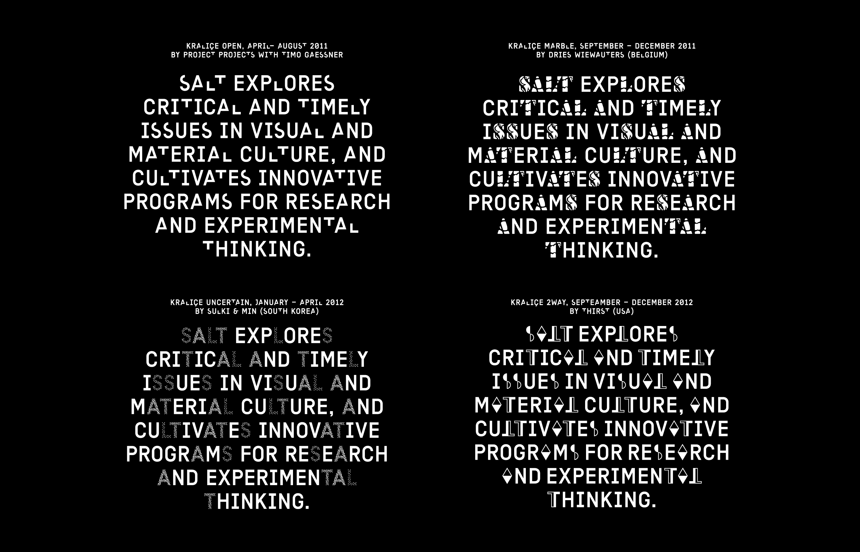
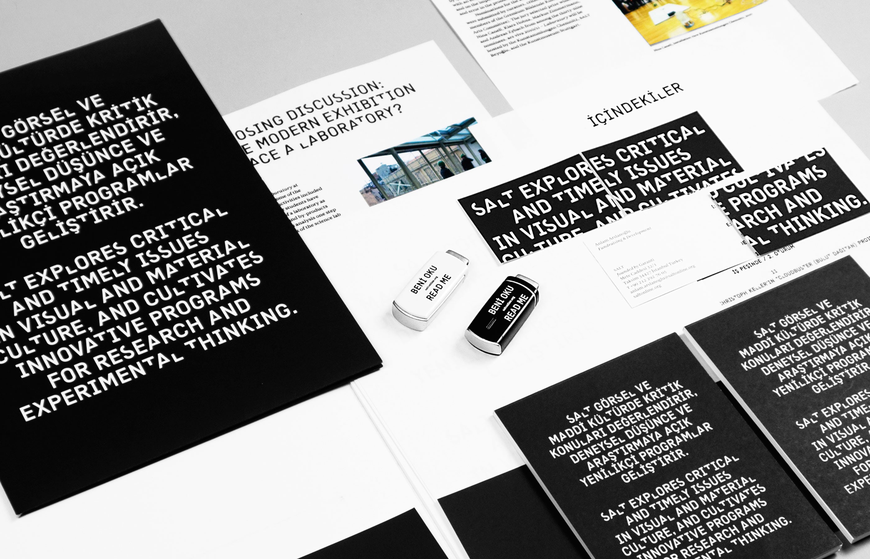
Instead of a static mark or an icon, Project Projects developed a typeface, Kraliçe, where the letters S, A, L, T, are separated where “the institution strategically disperses its name within the language it uses everyday.” The original typeface showed those four letters missing pieces, representing the identity being unfinished, allowing Project Projects to turn the identity into an evolving exhibition where they curated artists to recreate the letters every few months. All material produced uses the typeface with the letters commissioned at the time and each new page on the site gets updated with the updated letters, turning all materials from the institution into visual time stamp of its creation.
Up to that point, I’d never seen anything like what Project Projects did for SALT and it changed my whole perception of what graphic design could be. Flexible identity systems were not uncommon at the time but this was doing something more: it turned the identity into a curatoriy platform, shifting the design from project to partnership. Krishnamurthy and Michaels have a long interest in blurring the lines between their profession work and their intellectual interests but SALT still feels like the truest embodiment of this ideal. The studio turned what could have been standard branding project into their own curatorial experiment and they did it within the context of client work.
In college, I had learned about graphic design as a service profession. Still rooted in a modernist education, I was taught that the designer was invisible; a translator of the client’s needs. I learned that a logo is a static mark, probably a nice icon rendered in black and white and visible at any size, with some nice typography, that could work equally well on “a billboard or a business card”. The identity for SALT turned these rules I had absorbed upside down and, in many small ways, changed the course of my career. Since then, I’ve discovered countless designers working like this and uncovered all sorts of projects I would have otherwise skipped over. In some ways, when I went to graduate school in 2015, it was an attempt to reconcile my undergraduate education with these new approaches I was discovering.
For the last ten years, my work has revolved around a central prompt. At the risk of pretension, my critical project — manifested in Scratching the Surface, in my writing and publishing, and perhaps most importantly in my teaching — is to redefine graphic design. In some ways, the term feels dated: in some circles it’s fallen out of favor, replaced with terms like “brand strategist” and “product designer.” I’m trying to reclaim Graphic Design as a larger term that can encompass these other fields and continue expanding outward. I’m trying shift graphic design from problem solving to cultural production. I sometimes think everything I do is an attempt to rescue these two words and give them renewed meaning.
I recently noticed SALT updated their identity, replacing Project Projects’s system with a more traditional workmark. Project Projects, too, is no longer; the partners went off their separate ways with new studios and new projects. Yet I still turn to that 2011 identity, remembering my younger self seeing it nearly fifteen years ago. It might have been that project that started me on this work.
(You can see a few more images of its evolution in this 2013 post on It’s Nice That.)