No Finish Line and the ghosts of McLuhan
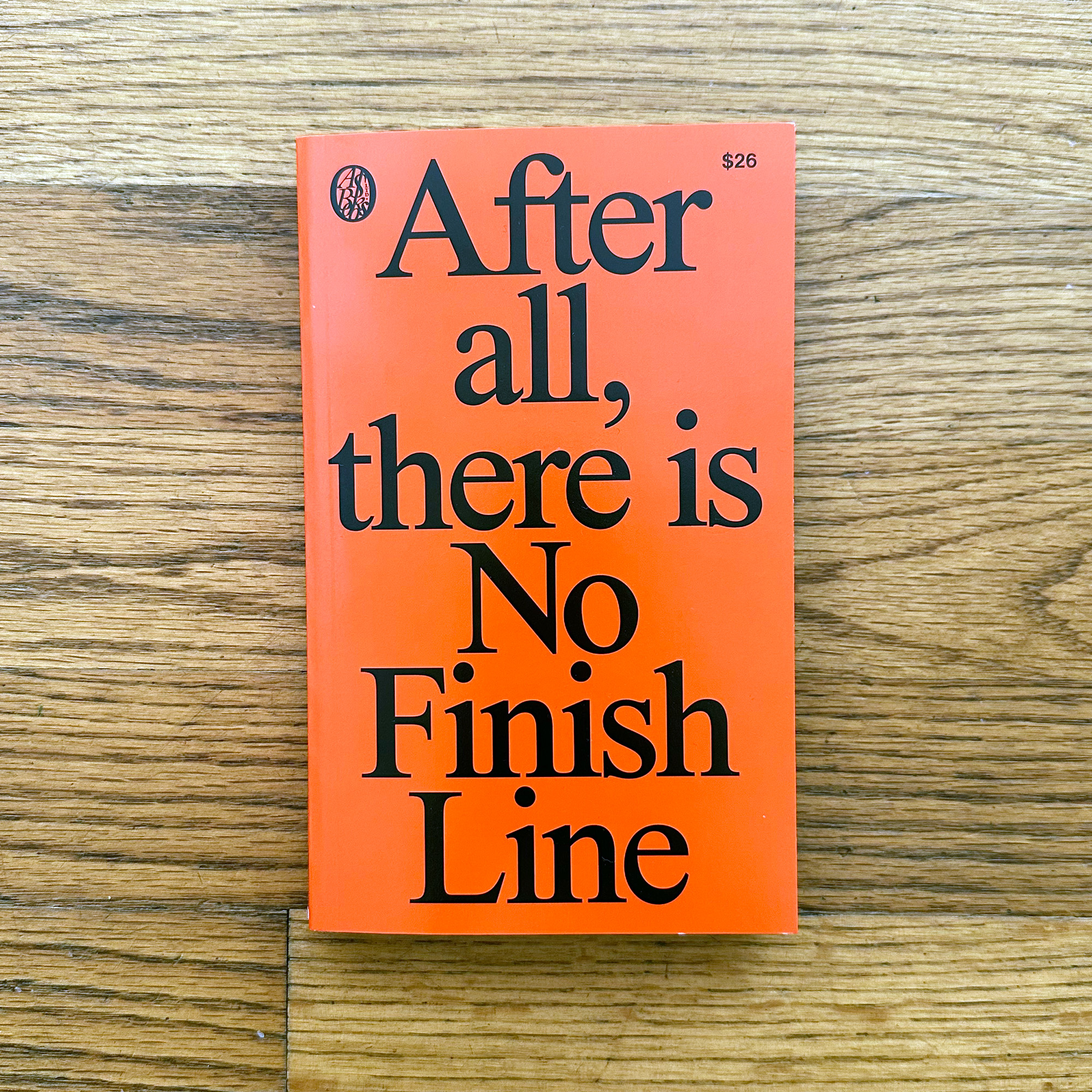
No Finish Line is a new book from Nike and publisher/designers Actual Source. Featuring a design by ZAK Group, texts by Sam Grawe, and short fiction by Geoff Manaugh1, this short, experimental publication looks at the intersection of sport and design and presents a vision, at the company’s 50th anniversary, of Nike’s design vision over the next fifty years. Thinking about the rise of big data, advances in customization, and technology platforms, the book paints a utopian picture for the brand, one that’s not just an apparel company but futurists, technologists, and innovators.
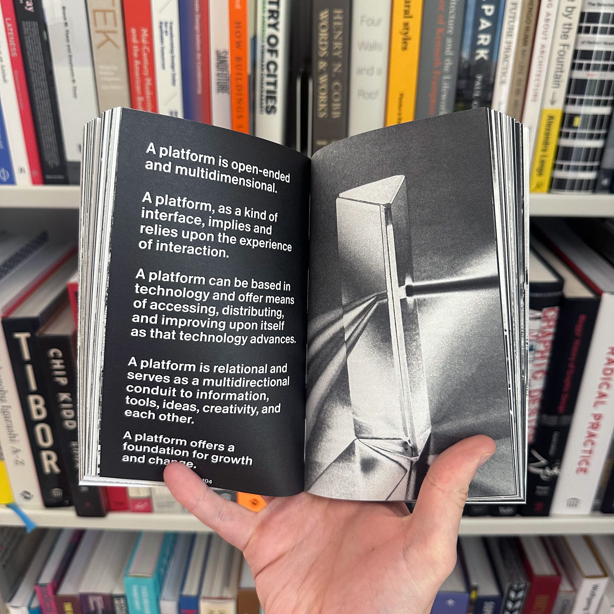
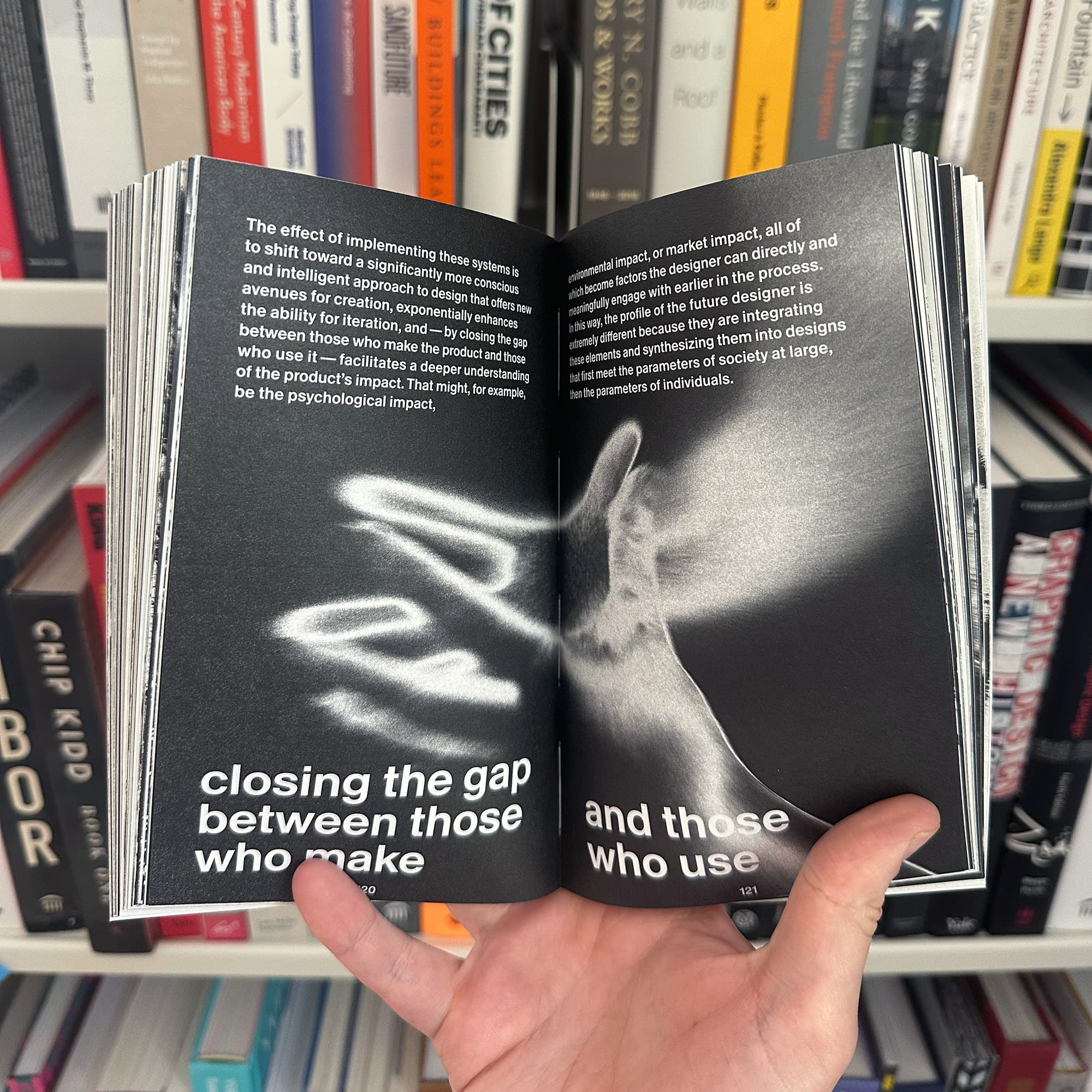
To present this vision, ZAK Group draws inspiration from Marshall McLuhan’s The Medium is the Massage. Housed in the same trade paperback format of McLuhan’s famous text, the design team borrowed the use of Helvetica and the marriage of text and image in a high-contrast black-and-white design. In reading the book, I could help thinking about why the visual aesthetic of The Medium is the Massage — which was published in 1967 — was both so ripe for appropriation and strangely fitting for this current moment.
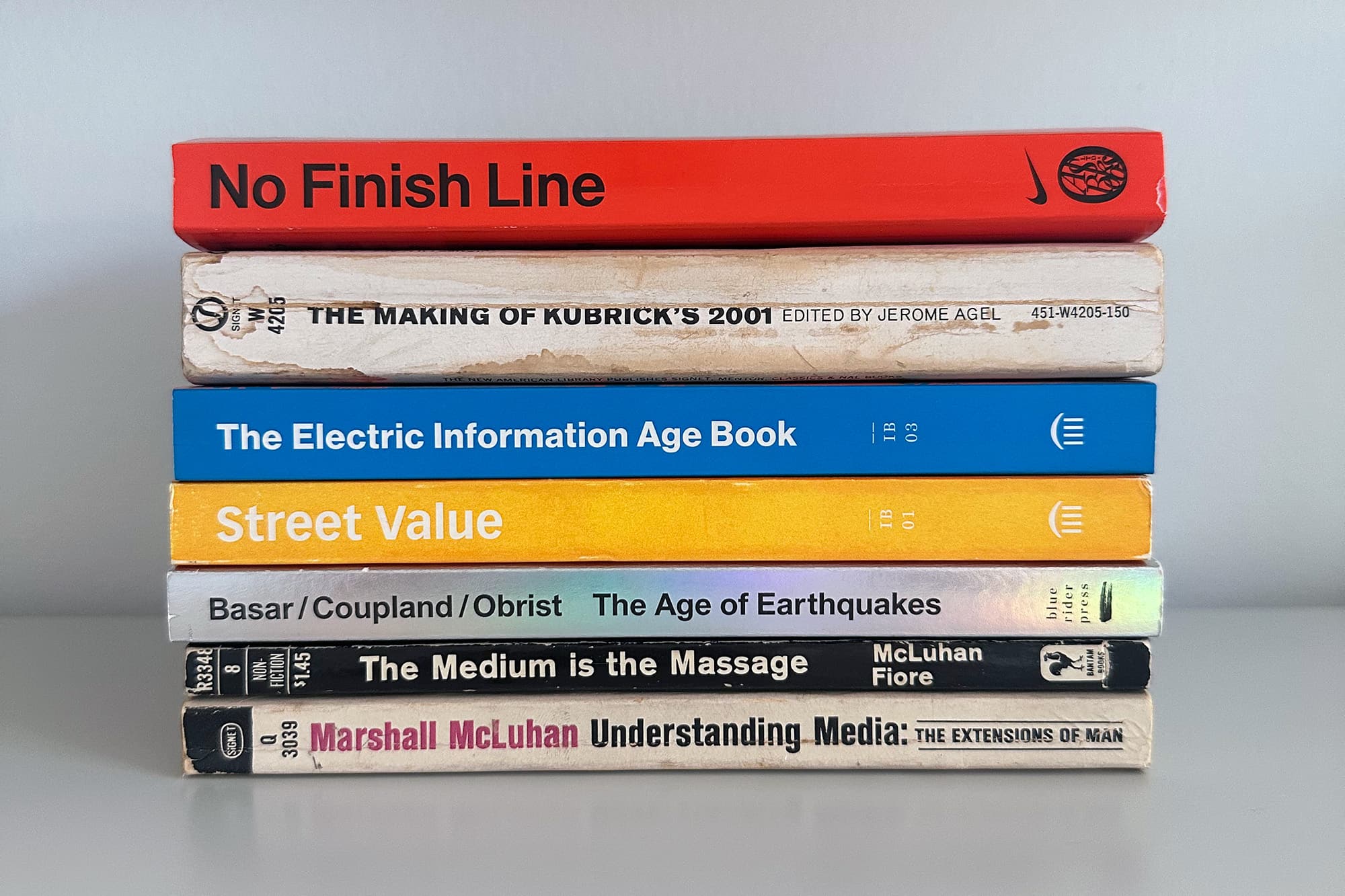
To be sure, No Finish Line isn’t the first book to reuse the now-famous aesthetic. I’m thinking of The Age of Earthquakes and The Extreme Self, two recent experimental paperbacks from Hans Ulrich Obrist, Douglas Coupland, and Shumon Basar2, which also borrow the visual language to great effect. The brilliance of those two books was seeing the resonances between McLuhan’s era and our contemporary condition. McLuhan was writing for the rise of television and wanted the book’s design to reflect that sense of flipping through the channels but his ideas predict the rise of the internet and later social media. This might be why the visual aesthetic endures, why it still feels relevant and modern and fresh: turning the pages feels like scrolling through a social feed.
The same is felt here. Grawe’s writing in No Finish Line feels McLuhan-like, confirming the design choice. It’s speculative and affirmative, written in short, pithy statements that build to a resonating energy. He even draws, adjacently, to McLuhan’s “this book is an extension of the eye…” when he writes of the shoe being an extension of the body.
Another contempory book that borrowed the format was The Electric Information Age Book by Adam Michaels and Jeffrey Schnapp. That book, the third and final installment in Michaels’s Inventory Book series, was about experimental trade paperbacks and looked at the design of books like McLuhan’s, Buckminster Fuller’s I Seem To Be A Verb and The Making of Stanley Kubrick’s 2001 A Space Odyssey. Produced by Jerome Agel and designed by Quentin Fiore, these paperbacks were a demonstration of the power of the book: that in marrying text and image, you could transcend both. A book could also be cinematic yet educational, contained yet networked.
I first read The Medium is the Massage my sophomore year of college. It was an assigned reading that, frankly, didn’t make any sense to me3 at the time but as I spent more time with it, it became a book that has become central to my work and teaching — I now reread it every year when I assign it to my own students. They, too, I think, find the ideas and their packaging relevant to their work. McLuhan is controversial, the book’s insights challenged but I find this book, again and again, always relevant.
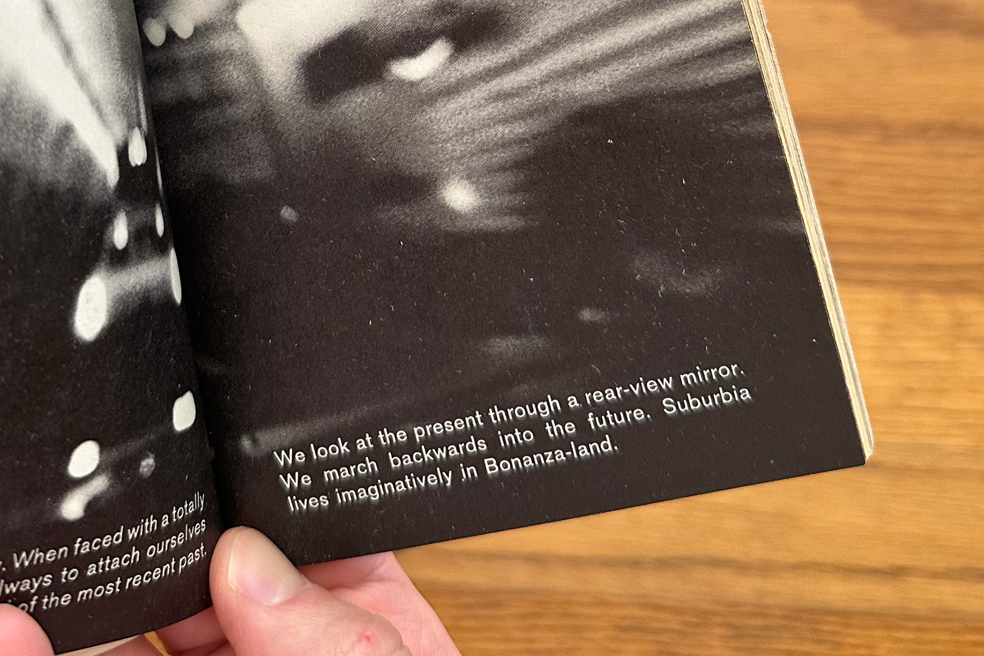
So why does this cut-and-paste, DIY aesthetic of the future still resonate fifty years later? I return to my favorite line in The Medium is the Massage: “We look at the present through a review mirror. We march backwards into the future.”
-
All former guests of Scratching the Surface — here are my conversations with Geoff, Sam, and Zak — which is why I was initially interested in the publication. ↩
-
I commissioned and edited this essay by George Kafka back in 2021 for Eye on Design looking at the visual design of The Extreme Self. ↩
-
I’m not sure the professor totally knew why they were assigning it either. It didn’t relate to anything else we did in that class. ↩